Reuben’s Brews


I truly appreciate Top Hat's attention to detail and the way they approach storytelling: the team was able to incorporate themes we discussed on their first morning at our brewery in to the updated design of our year-round cans in a way that is simply impressive. When I began to search for a new design partner that would help lead us in to the next chapter of our visual identity, I was looking for team that had the right balance of skill, talent, and vision. Top Hat has delivered on that promise in every way.
Beer Unbound
From a humble operation in a tiny taproom to the most decorated brewery in Washington, Reuben’s Brews has been characterized by uncompromising standards.
The same unwillingness to settle for “good enough” led the team to engage Top Hat for an all-encompassing overhaul of their brand in the midst of massive growth. From our first meeting in their Ballard taproom, it was clear that they expected nothing short of excellence. And so, we eagerly got to work.
![]()
![]()
![]()
![]()
![]()
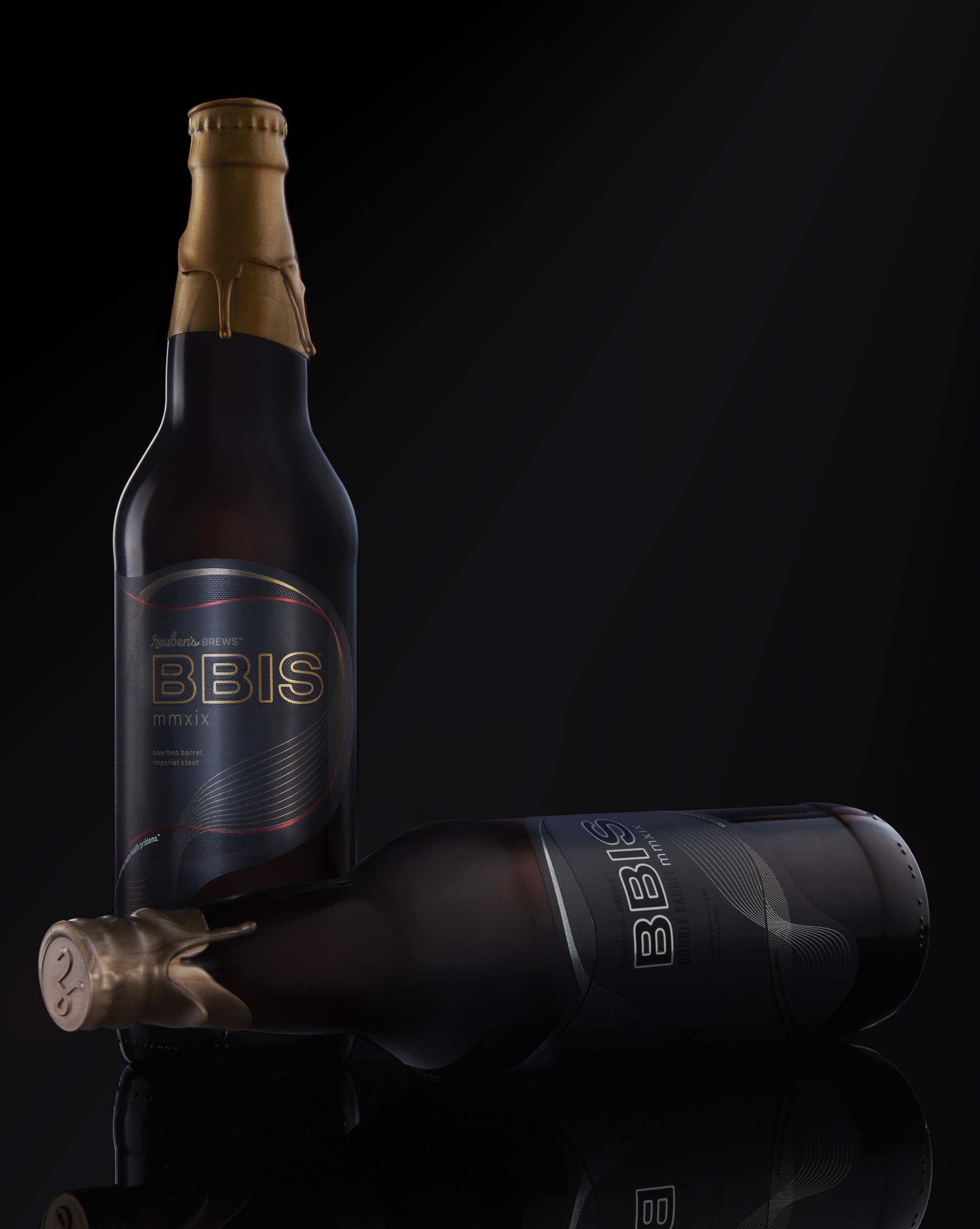
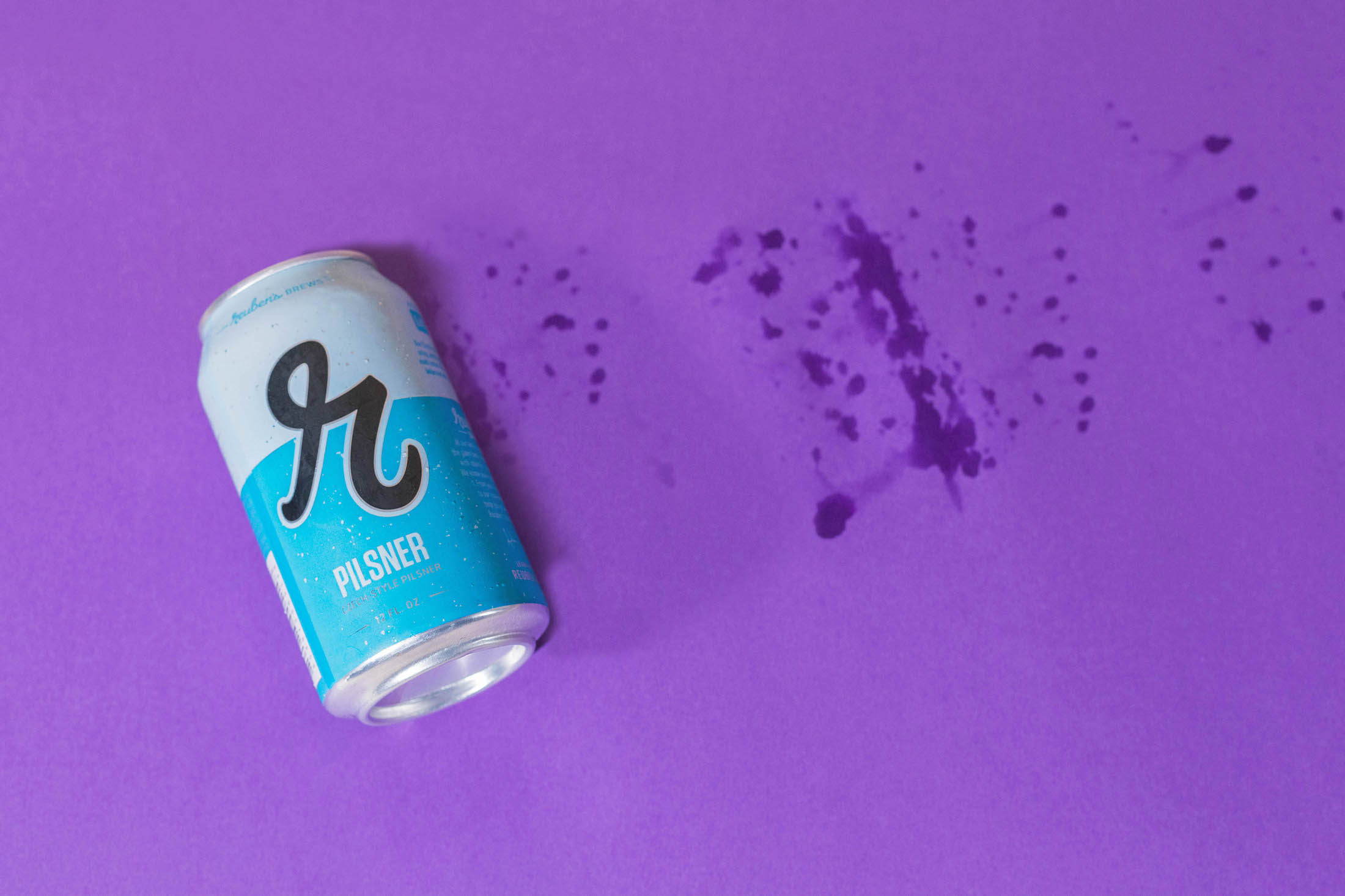
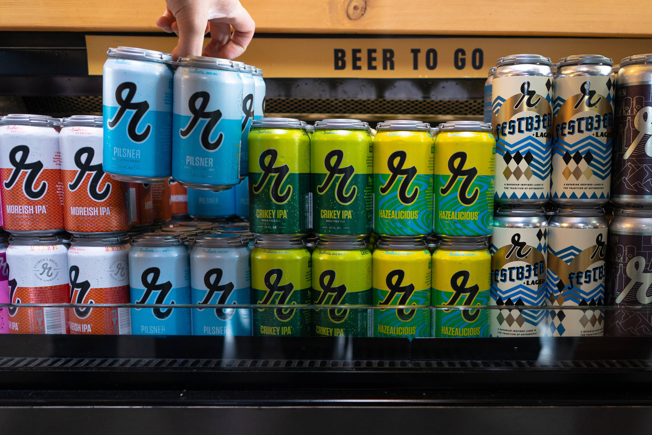
‘R’EVOLUTION
When a brand has fought tooth-and-nail for 7 years to earn the type of reputation Reuben’s has, our first responsibility as designers was to not destroy the equity of the existing brand. Maintaining the prominent placement of their signature lowercase ‘r’ was a given, but we evolved the mark to be more dynamic and distinctive.
The cans were given a bolder color treatment, a place to tell Reuben’s story, a place to describe the brew, and a design that allows the ‘r’ to break the plane of an otherwise conventional two-tone layout to give a subtle nod Reuben’s new tagline: Beer Unbound. Innovative use of substrate helped provide depth to the art.


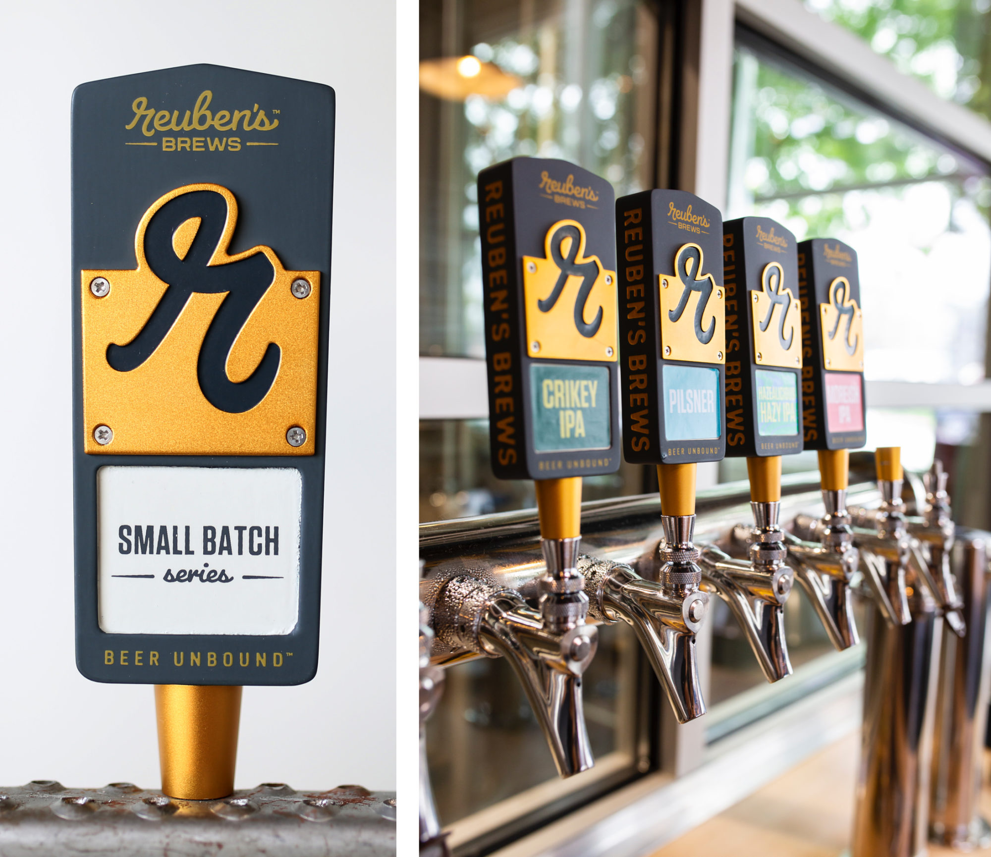
AN ADAPTABLE IDENTITY
We took care to craft a brand that’s malleable, yet recognizable, on any application – signage, collateral, packaging, cans, koozies, glassware, apparel, and anything else the Reuben’s team will throw our way for years to come.


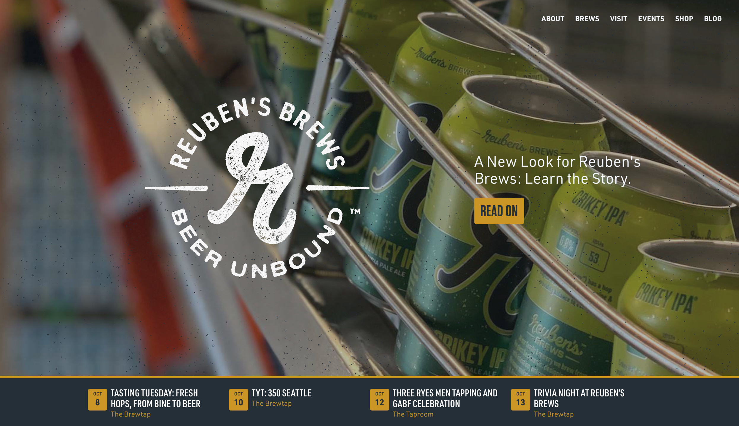
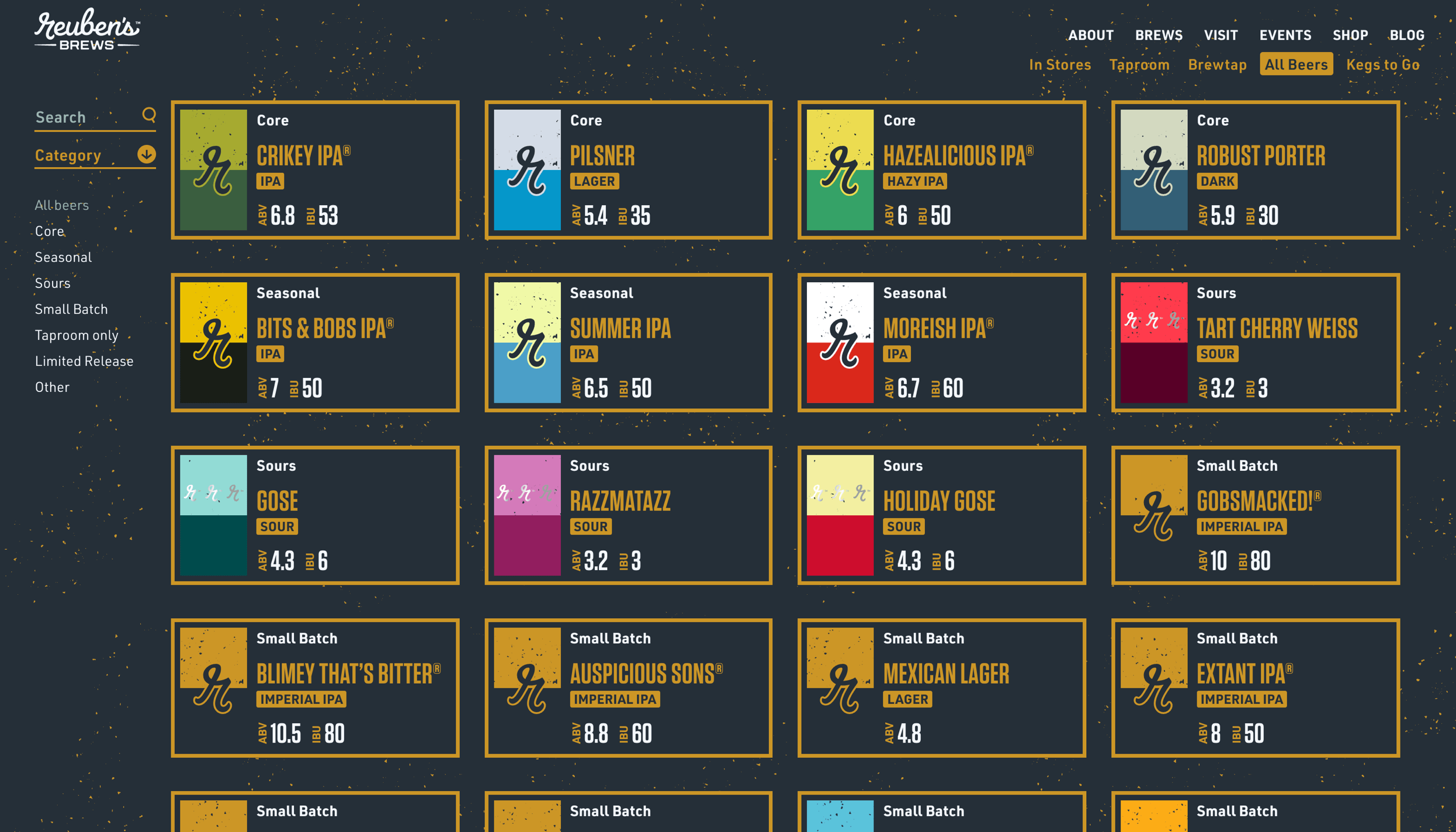
A WEBSITE Built for Exploring
We designed an approachable website that tells the story of Adam and Grace and their growing brewery. Then, we packed it full of special functionality to let their most loyal supporters geek out, while making it easy for the Reuben’s team to keep their taplist and ever-growing archive of beers up-to-date.


A Very Happy Adam
& Grace Robbings
