As Fresh As It Gets
With over two years of thriving business in Downtown St. Pete, Florida poke bowl and sushi burrito concept, Pacific Counter, came to Top Hat on the verge of opening their second location across the pond in Lakewood Ranch. They had much to be proud of, including a vibrant brand aesthetic and a strong following. But along with this meaningful step of growth, they were in dire need of new website build — one that did their core brand justice, provided a simple online ordering system, and portrayed their beautiful food at the forefront.


Shoot it in raw
The key to nailing the perfect website for a chef-driven restaurant is beautiful food photography. For PC, that meant photographing every ingredient and recipe on the menu from bowl toppings and mix-ins, to sushi burritos and tsunami bowls. We tapped local photographer Stephanie Agudelo to capture the full menu. If Pacific Counter has it, we shot it. Then we ate it. Waste not, want not.

Surf’s Up, Dude
With a huge bank of photos, we were able to expand on PC’s colorful brand aesthetic and create an inviting, unique, and playful website that jumped off the screen with fun animations. A core focus of the site was an educational menu that housed every piece of information about each ingredient and recipe. We made sure to leave no stone unturned, marking each bowl and roll with an in-depth, photo-driven listing of what’s inside.


We invite you to craft
your own cuisine in an
environment that inspires
healthy eating, drinking,
thinking, and being.
Order Takeout. Everybody’s Doing It.
In the wake of last year’s changes in the restaurant industry, the high-level goal of the site was to drive viewers to order online. We accomplished this with clear calls to action from the homepage, encouraging people to choose to “bowl it or roll it”. We also developed a delivery map to help PC customers know their nearest location no matter how many restaurants there are in the future.


More Mahalo
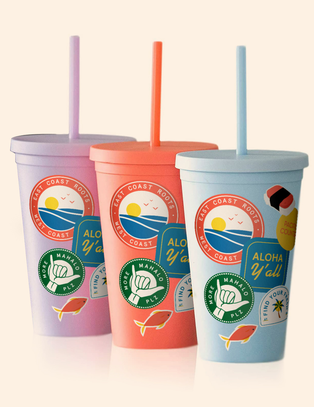
While we were heads-down on website development, PC’s owners tapped us to create a new batch of merch that could highlight the restaurant as both a local hotspot and a lifestyle brand. We also were tasked with capturing our city’s immense support of diversity and inclusion by creating a suite of pride designs that played off the brand’s color palette.


I SEA WEINERS in your future.
With a launched website, fresh merch line, and a new suite of print materials, we rounded out our efforts with a revamp to PC’s menu system. Their menu designs were sound as they were, but needed to include their new menu offerings, hot dogs and bubble tea. We also needed to tweak the flow of their menu-boards to include callouts for their new items and their catering program.


New project? Question? Compliment? Let’s chat. New project? Question? Compliment? Let’s chat.


